.svg)
DURATION
Skoop is a proptech platform addressing a critical challenge in the lending and financial advisory space: fragmented communication and underutilized homeowner equity. While loan officers often lack the bandwidth to deliver timely, personalized advice at scale, homeowners are largely unaware of the financial potential embedded in their property.
Skoop bridges this gap through a CRM-powered ecosystem that provides mortgage professionals with personalized financial insights and automation tools while empowering individuals to unlock, understand, and act on their property equity.
Homeowners often struggle to understand and leverage their home equity, while loan officers face the challenge of delivering timely, personalized guidance at scale. In a highly competitive lending and advisory space, fragmented tools and outdated interfaces hinder both activation and engagement.
To succeed, platforms need to build trust, drive clarity, and convert passive users into active financial decision-makers.

United States (nationwide), focusing on the mortgage lending and homeowner financial empowerment sector.
The platform design needed to resonate with U.S. homeowners accustomed to high standards in proptech UI/UX, combining sleek, mobile-first experiences with transparent, actionable content that builds trust and communicates financial confidence.

Skoop’s existing landing page was internally built but lacked the clarity, aesthetic, and UX psychology needed to convert visitors into users at a high conversion rate. As a core entry point into the platform, the landing page did not sufficiently convey Skoop’s value, nor did it guide homeowners toward meaningful actions like booking a call with a financial advisor.
The landing page lacked modern visual appeal, emotional engagement, and optimized user flow. Moreover, as the platform matured, they required new features to help users explore property investment opportunities tailored to their financial profiles. This created the need for a fresh, mobile-first design with intuitive navigation, compelling content structure, and scalable components that can align with Skoop’s brand identity and business goals.

The solution needed to be redesigned as a high-conversion, mobile-first experience. It was anchored around three key principles:
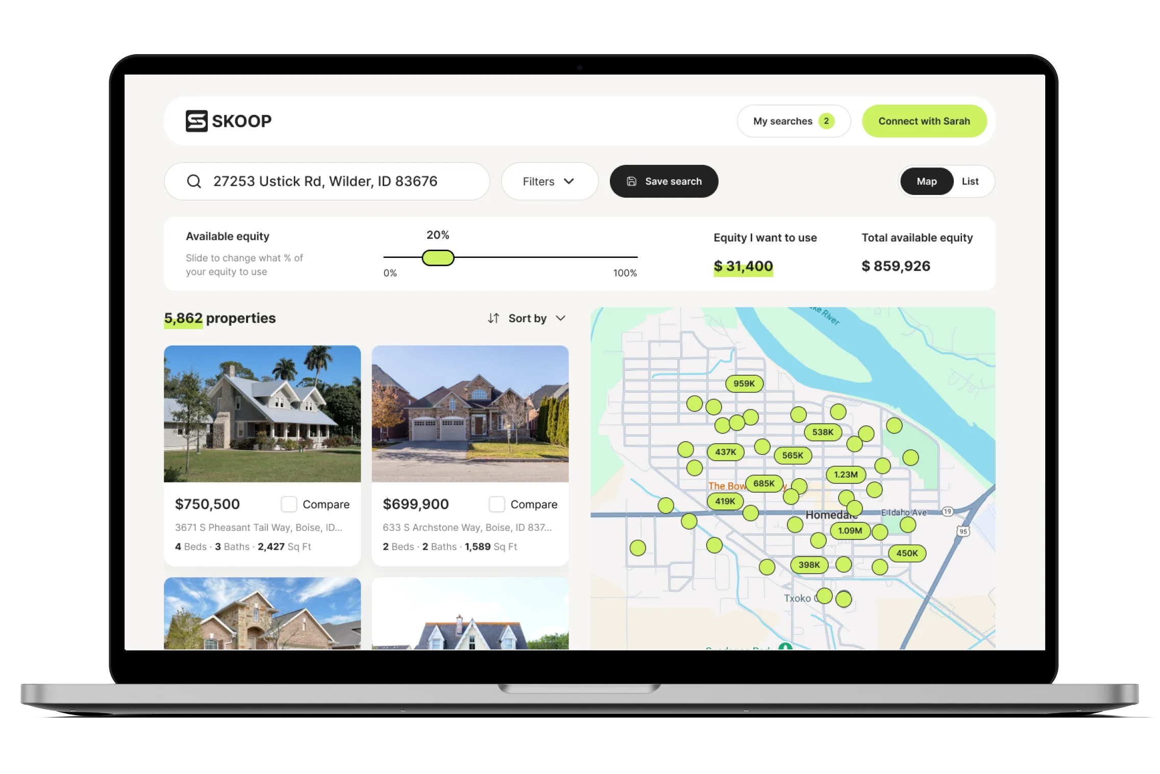
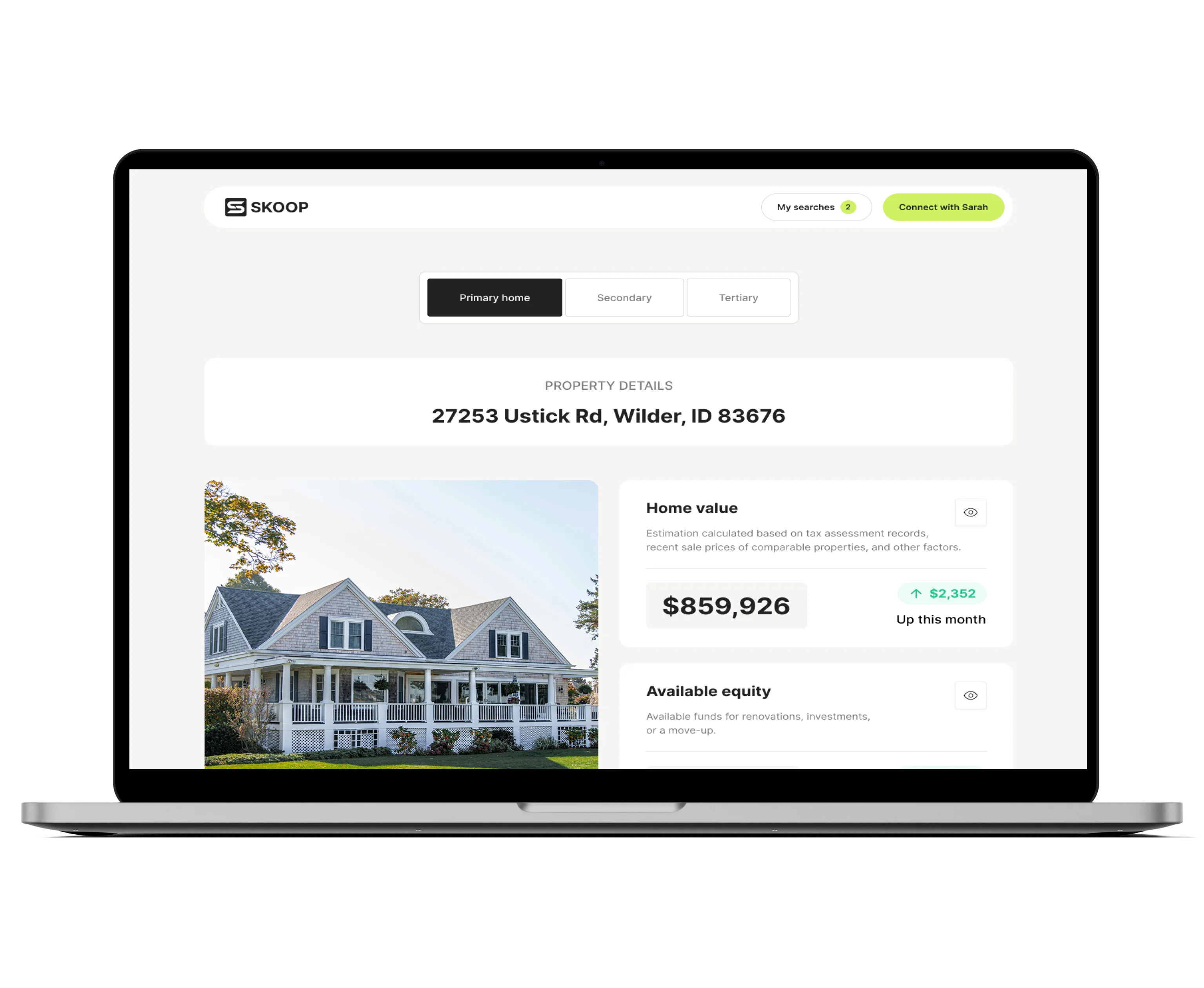
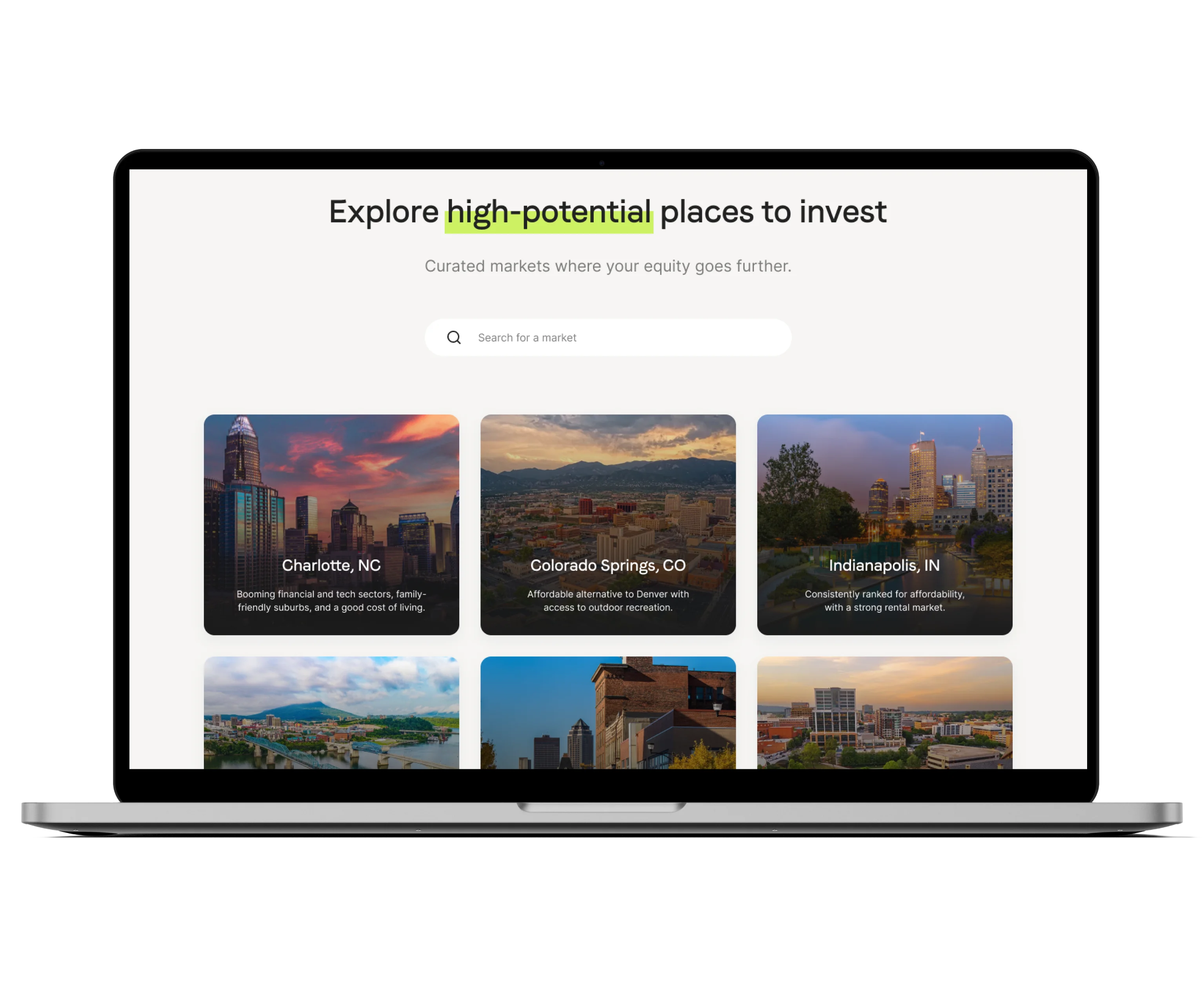
Later, we extended the solution by designing three new features, Guided Property Search, Generic Property Search, and Featured Markets, which support Skoop’s broader mission to empower financial decision-making through personalization and data. These features were designed to blend seamlessly into the existing platform architecture, maintaining a cohesive and intuitive user experience.
Together, this work helped Skoop transform its digital presence into a more effective growth engine.
We began with a deep discovery process:
From this, we defined a new section structure, developed wireframes, and delivered high-fidelity designs for both desktop and mobile. The landing page was optimized around trust, clarity, and user action, with a strong “Schedule a Call” funnel.
Following the landing launch, Skoop returned with newly defined product requirements. Linnify translated those into design specs for:
We delivered user flows, clickable prototypes, and a modular design system ready for development, ensuring all assets were aligned with brand and technical guidelines.
This collaboration transformed Skoop’s digital touchpoints into a cohesive, modern experience that inspires confidence and action among homeowners.


The collaboration with Linnify helped Skoop transform its homeowner-facing experience into a modern, trust-building activation tool. By redesigning the landing page and defining the vision for scalable property search features, Skoop reinforced its position as a forward-thinking player in the financial advisory space, ready to convert engagement into action.
This project strengthened Linnify’s capabilities in high-conversion UX, design psychology for proptech, and property search UX in emerging lending platforms. Through close client collaboration and a design-led approach, we laid the foundation for a richer Skoop experience and future feature scalability. Skoop continues to evolve its product offering with the insights and systems established during this collaboration.

The original landing page lacked visual clarity, modern UX flow, and strong conversion elements. It didn’t clearly communicate Skoop’s value or guide users toward booking calls with financial advisors.
The goal was to create a high-conversion, mobile-first interface that builds trust, clarifies Skoop’s value proposition, and drives users to take action, primarily by scheduling a call.
Linnify redesigned the landing page and later delivered design specifications for:
All were designed to align with Skoop’s equity-focused mission and integrate into the existing product architecture.
The platform is designed for U.S. homeowners and mortgage professionals, with a focus on homeowner financial empowerment and equity education through modern, data-driven tools.
Linnify conducted: